UWM DIPTYCH ILLUSTRATION
Picture will be uploaded shortly.
Title: Products of the Bar
Size: 30.48cm x 40.64cm
Medium: Colored Pencil
November 2019
"Products of the Bar" shows how we set expectations based off appearances of others, whether they be negative or positive. In this case, it was "beautiful vs ugly" using Shrek characters and influence of Alphonse Mucha, depicting prettier figures
INSPIRATION
|
|
|
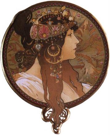
Alphonse Mucha, "Byzantine Head. The Brunette" (Lithographic Portrait, 1897, 34.5cm x 28cm)
|
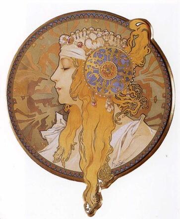
Alphonse Mucha, "Byzantine Head. The Blonde" (Lithographic Portrait, 1897, 34.5cm x 28cm)
|
Alphonse Mucha, 1860 - 1939, is one if not the staple artist of the art nouveau era which accorded during (1890 - 1905). His work featured the groundwork's of the art nouveau nature, being muted tones sistered with flowers, organic shapes, jewels and young women in neoclassical clothing. This art was used as a way to integrate newer, vibrant art into the modern era. Much of Mucha's work featured on advertisements for various products, most famously cigarettes.
Though the characters I've drawn were originally 3-D, they could be transferred to Mucha's iconic style. The line-work in the piece had to be more organic, less structure and more wavy. The colors are more natural in color, muted earth tones despite what their color palette might be. Plants, usually leaves or flowers hold up the again naturalist theme. Using Mucha in the first place is also very ironic. His work is associated with being beautiful and I wanted to play on this. The characters are opposites by outward and first glace at appearance. I wanted to use this style to reflect their insides, hidden but beautiful.
Though the characters I've drawn were originally 3-D, they could be transferred to Mucha's iconic style. The line-work in the piece had to be more organic, less structure and more wavy. The colors are more natural in color, muted earth tones despite what their color palette might be. Plants, usually leaves or flowers hold up the again naturalist theme. Using Mucha in the first place is also very ironic. His work is associated with being beautiful and I wanted to play on this. The characters are opposites by outward and first glace at appearance. I wanted to use this style to reflect their insides, hidden but beautiful.
PLANNING
Pictures to be uploaded shortly.
Originally, I had planned to use just Shrek and not Fiona, and instead using Dio Brando from Jojo's Bizarre Adventure as a metaphorical way to show to learn about a person before you make a real judgement on them (Shrek being unappealing but kind hearted and Dio being handsome yet rejected his own humanity). I decided against this idea, since the only clear connection between the two characters is that they were iconic on the internet; difficult for people who hasn't seen one or the other to make this connection. Shrek's wife, Fiona, was added instead, seeing as they were literally protagonists of the same franchise, plus carried the original theme connection of opposites, it just made sense. I went with Seasons, by Mucha at first, since they were highly recognizable just as the characters. I had them being opposing between sherk and human to show how they are inside, but felt that within the time frame and other school work it wouldn't be quality.
PROCESS
Pictures to be uploaded shortly
Never before have I used colored pencils for a actual piece of art before. Never using them before greatly hurt me. Deep in my soul. Blending must have been the absolute strangest thing I've done, but grateful I learned how to do so along the way. Pressing too hard caused deep unchangeable marks while applying the colors lightly caused other colors to be blended easier.
EXPERIMENTATION
At first, I used a dark green prisma-color, not realizing how to use them so it turned, very dark. The lines, never blended with the other colored pencils so they still exists to this day. I then tried to do the backgrounds in a lighter color, yellow. That blended better into the background, colored or blended in by other similar colors.
RELFECTION
Honestly, very happy with this piece. It's the first one I was very excited to make and glad how it turned out overall. Though there are some elements I do wish to change next time around. Possibly better blending and additional details revealing more of their character and how others feel about them would help emphasize the piece.
COMPARE AND CONTRAST
Pictures will be uploaded shortly
|
Compare
|
Contrast
|
ACT QUESTIONS
1) The inspiration in this case, Mucha, caused my artwork to be based off organic shapes and muted colors.
2) Generally people seem to praise his work, emphasizing how these are literally commercials .
3)Organic work seems highly appealing to the masses.
4) Judgement. Humans are built with it no matter what we claim, this concept drove my inspiration.
5)Again, people are drawn to organic beauty.
2) Generally people seem to praise his work, emphasizing how these are literally commercials .
3)Organic work seems highly appealing to the masses.
4) Judgement. Humans are built with it no matter what we claim, this concept drove my inspiration.
5)Again, people are drawn to organic beauty.
